How to Read a Price Chart
 Video coming soon on YouTube
A bar on a chart is four numbers: where the day opened, the highest it reached, the lowest, and where it closed. That is the entire contents. Everything else people read in it is added by the reader.
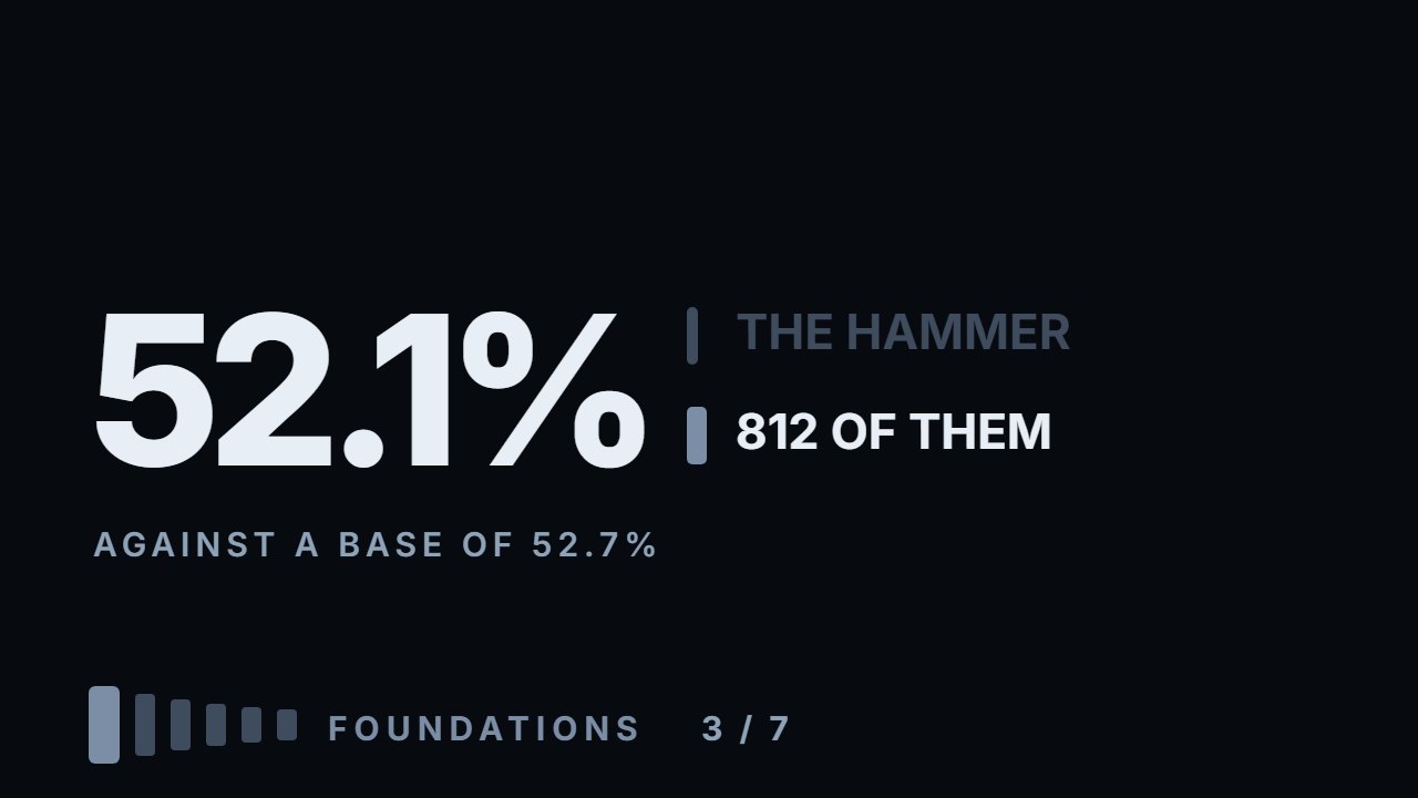
Two of the most common readings were counted on nine thousand daily bars across six instruments. A close near the high — supposedly strong — was followed by a higher day 52.3% of the time, against a base rate of 52.6%. The hammer, 812 of them, gave 52.1% against 52.7% for every other bar: slightly worse than not looking at the chart at all. And four numbers cannot contain the order events happened in, which is not a limitation of your charting software — on the three stocks, 32% of days finished on the opposite side of yesterday's close from where they opened. What does carry information is size: after a bar bigger than 1.5× the instrument's usual day the next session moves 0.69 of a daily range, after a quiet bar 0.19. Everything here is measured: the calculation ships with the video.
What to do with this
Open a daily chart and pick twenty bars at random — not ones you remember. For each, write down what you would have predicted from its shape alone, then look at the next day and mark whether you were right. Most people land near fifty per cent and are surprised.
Chapters
- 0:00A bar is four numbers
- 0:36What is honestly in there
- 1:09The body is 45% of the range
- 1:42Why the close carries the weight
- 2:32A bar is a report on a disagreement
- 3:24Dropping to a smaller timeframe
- 4:1132% of days reverse after the open
- 5:06Reading one: the strong close
- 5:33The base rate that makes it readable
- 6:13Reading two: the hammer
- 6:56Three honest limits
- 7:36What is worth reading in a bar
- 8:18The one reading that works: size
- 9:07Go and do this
The calculation
Every number this lesson says out loud comes from the script below. results.txt is what it printed when the video was made.
Full transcript
A bar on a chart is four numbers. Where the day opened, the highest price it reached, the lowest, and where it closed. That is the entire contents.
People read a great deal more than four numbers in it. Nine thousand bars later, most of what they read is not there.
By the end of this you will know exactly what those four numbers tell you, one thing they cannot tell you no matter how carefully you look, and what happened when two of the most common readings were counted.
Start with what is honestly in there. The high and the low are the edges of the argument. That is the furthest anyone was willing to pay and the furthest anyone was willing to accept, in one session.
The open is where the argument started. The close is where it stood when the bell went. And the close is the only one of the four that anybody was forced to accept.
Which is why the close carries more weight than the rest, and why every rule on this channel is written on closes.
Now the first measurement, and it puts a number on the argument. Across nine thousand bars, the body — the distance from open to close — is a median forty five per cent of the range. A hollow body closed higher than it opened; a filled one closed lower.
Meaning fifty five per cent of everything price travelled in a day was given back before the day ended. On more than a third of all bars, the body is under a third of the range.
One more thing about the close, because it is the number the rest of this channel is built on. On a stock, at the end of a session there is an auction, and everyone who must be positioned by the bell has to take whatever it clears at. Crypto has no bell; that difference gets its own video.
The high and the low are prices somebody chose to pay. The close is a price a great many people had to accept. That is why rules are written on closes and not on wicks, the thin lines above and below the body.
That is the previous video, seen one day at a time. Two sides, broadly balanced, and most of the motion cancelling.
So a bar is not a picture of movement. It is a report on a disagreement, and the body is whatever was left over.
Now the thing a bar cannot tell you, and this is not a limitation of your chart software.
Four numbers do not contain the order events happened in.
Take a day that opened, fell hard to the low, then climbed all the way to the high and settled in the middle. And take a day that opened, rose to the high first, then collapsed to the low and climbed back to the same middle.
Two completely different sessions. Opposite stories. Identical bar.
You cannot tell them apart, ever, from the daily chart. The information is not hidden — it was never recorded.
The obvious answer is to drop to a smaller timeframe. Look at five minute bars and the order of the day becomes visible, because now you have seventy eight bars instead of one.
That works, and it is worth doing. But notice what you have actually bought. Each of those seventy eight bars is four numbers with exactly the same hole in it. You know the sequence of the five minute bars; you do not know the sequence inside any of them.
This is not a data problem you can spend your way out of. Any record that compresses a stretch of time into four numbers loses the order, and every chart you have ever looked at is that record.
There is a number for how much that matters. Take every stock bar in the sample and ask whether the day finished on the same side of yesterday's close that it opened on. Thirty two per cent of the time, it did not. Coins are left out: they trade all night, so their day opens where the last one closed.
Nearly a third of stock days reversed their own direction after the opening. Whatever the bar looks like at the end, in one day out of three it spent part of the session saying the opposite.
Which has a consequence that most chart education walks straight past. Any reading of a single bar that depends on sequence is reading something that is not in the data.
The two most common readings both depend on it, so both were counted.
Reading one: a bar that closes near its high is strong, and price should follow. Nine thousand bars, split by where the close landed in the range.
Closed in the top third: the next day was higher fifty two point three per cent of the time.
Closed in the bottom third — supposedly weak — fifty two point eight.
The middle: fifty two point eight as well.
Before reading anything into those, here is the number that makes them readable. Across all nine thousand bars, the next day was higher fifty two point six per cent of the time.
That is the base rate. Everything drifts up slightly, and any group measured without it looks meaningful when it is not.
So the strong close gave fifty two point three against a base of fifty two point six. The weak close gave fifty two point eight. Both are inside half a per cent of doing nothing.
And the strong one is on the wrong side of it.
Reading two, and this one has a name. A long lower wick — price fell hard and came back — is read as a rejection of lower prices. The hammer.
Eight hundred and twelve of them, defined as a lower wick longer than sixty per cent of the range. The next day was higher fifty two point one per cent of the time.
Every other bar: fifty two point seven. The hammer performed slightly worse than not looking at the chart at all.
Say it plainly. On this sample, at this timeframe, the shape of a single bar told you nothing about the next day.
Now the honest limits, and there are three.
This is one timeframe. The same shapes on a five minute chart are a different question, and this measurement does not answer it.
This is one definition of a hammer. Move the threshold and the number moves a little. It does not move to something that works.
And a single bar is not the same as a bar in a place. A hammer at a level everyone is watching is a different situation from a hammer in the middle of nowhere — that is the levels module, and it is where the difference lives.
Which is the useful ending, not a negative one. There are things in a bar worth reading, and they are all comparisons.
How big is this bar against the instrument's usual day. That is the range module, and it tells you whether something happened or nothing did.
Where is this bar relative to a level. That is the levels module, and it tells you whose orders are nearby.
Where did it close — because the close is the number people had to accept, and it is the one you build rules on.
None of those is a pattern in one candle. All of them are a bar compared with something outside it.
And there is one reading that does work, which is worth ending on because it is the same shape as everything else on this channel: a comparison, not a picture.
Split the bars by size. After a bar bigger than one and a half times the instrument's usual day, the next session moves zero point six nine of a daily range. After a bar smaller than six tenths, zero point one nine.
Three and a half times the movement. That is a real difference, on the same nine thousand bars where the shape gave nothing at all.
So size carries information and shape does not. Which is convenient, because size is the one thing you can measure without deciding what anything means.
So, the thing to go and do, and it will take twenty minutes.
Open a daily chart and pick twenty bars at random — not ones you remember, random ones. For each, write down what you would have predicted from its shape alone.
Then look at the next day and mark whether you were right.
If you land near fifty per cent, that is the surprise: reading candles feels like reading, and being wrong at it does not feel like being wrong. It feels like the market being unfair.
The four numbers are honest. They just say less than the industry built on top of them needs them to say. Educational content only. Nothing here is financial advice.
Educational content only. Nothing in this video is financial advice, a recommendation to buy or sell, or a promise of any result. Trading involves risk of loss. Do your own research. Risk warning.