The Levels Everyone Sees
 Video coming soon on YouTube
This video was planned as an explanation of why the levels everybody sees work better. Then the previous video measured that claim and found nothing — so the question changed instead of the answer. If a visible level does not turn price around more often, does it do anything else?
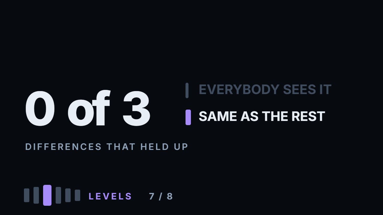
Three places were measured on six instruments, and none of them shows a difference beyond what the data can tell apart. The size of the day price reaches the level: about the same on the stocks, louder on all three coins — beyond its own noise only on Bitcoin. False breaks: no lean at all — three instruments each way, −1.3 ± 3.8 points together, on seventeen to sixty pokes an instrument. How far price runs after closing beyond the level: further on five of six since December 2023, when the crypto data begin; over all the years, slightly shorter, within the noise. So the tidy story — a visible level is where price goes through, not where it turns — is a mechanism without a measurement. The most useful part is a mistake caught before publishing: over all the years stocks and crypto looked like opposites, until both were recounted on the same window and the split disappeared — it was a split between years, not markets. Everything here is measured: the calculation ships with the video.
What to do with this
Take a chart and mark the single most obvious level — the sixty day high or low. Then find three turns nobody would circle. Go back through the last year and count, for each, how often price poked through and came back, against how often it went through and kept going. Then see which group produces the clean breaks on your chart — and remember that one year of one chart is a handful of events.
Chapters
- 0:00The claim this video was going to explain
- 0:29If it does not turn price, what does it do
- 1:09Measurement one: the size of the day
- 2:00Measurement two: the false break
- 2:26It leans the other way — within the noise
- 3:22Measurement three: how far it carries
- 3:56The tidy story, and why it is not established
- 4:27The mechanism behind the story
- 4:57Markets, or years?
- 6:35The rule that follows from it
- 6:47The one difference that leans on all three coins
- 7:41Three honest limits
- 8:26What to do with a level everybody sees
- 9:40Go and do this
The calculation
Every number this lesson says out loud comes from the script below. results.txt is what it printed when the video was made.
Full transcript
Everyone is told that the level everybody can see works better. Measured in the previous video, it does not bounce better.
A level that is a sixty day extreme — the one you notice at a glance — bounced almost six points better than an unremarkable one on Apple, six better on Tesla, almost three worse on the index fund, and between minus six and a half and plus two on crypto.
So the honest thing is to change the question rather than the answer. If a visible level does not turn price around more often, does it do anything else? By the end you'll know what the numbers say an obvious level is good for — and how little that is.
Because it seems it should do something. Everybody watches it, orders sit at it, and it appears in every chart people share. If that attention shows up anywhere, it should be measurable.
Three places were measured, and in none of them does the difference clear what six instruments can tell apart.
Measurement one. The size of the day price arrives at the level, in that instrument's usual daily ranges.
If a visible level gathers action, the day it gets touched should be a bigger day than usual.
On Apple it is slightly smaller: one point one seven against one point two five. On the index fund it is smaller: one point zero six against one point two five.
On crypto it is bigger. Bitcoin, one point seven eight against one point two nine. Solana, one point five eight against one point one four.
On all three coins, price arrives at an obvious level on a louder day than usual; the stocks show no clear sign either way. Hold that thought — it comes back at the end.
Measurement two, and this is where it gets useful. The false break.
Price pokes through the level and then closes back on the original side within two days. That is the setup the whole setups module is built on.
The expectation is that a visible level produces more of these, because that is where the stops are, and stops are what a poke collects.
Measured, Apple goes the other way. A poke through a visible level came back fifty per cent of the time, against fifty nine point eight for the unremarkable ones.
That is ten points less often. Tesla went the other way, six more. The index fund, two less. Bitcoin, plus zero point two. Ethereum, seven more. Solana, eight less.
Median across six: one point fewer, three of the six each way. Each instrument has only seventeen to sixty pokes at visible levels, and together it comes to about one point — nothing.
So there is no lean here at all: on this many events, a visible level cannot be told apart from an unremarkable one by how often a poke comes back.
Measurement three. When price does close beyond the level, how far does it go in the next five days?
Lately, further. Counted from December 2023, when the crypto data begin, the visible level is followed by a larger move on five of the six — Apple is the exception, and on Ethereum the difference is close to nothing. Over all the years, all six together lean the other way — shorter — and not beyond what the data can tell apart.
Put those two together and you get the story this video expected to tell: a visible level is not where price turns around. It is where price goes through.
It is a tidy story, and these numbers do not establish it. False breaks do not lean either way, and the further move shows up lately and reverses over all the years — neither clears what this many events can tell apart.
There is a mechanism, and it is the same one from the first module. A level everybody sees is a level everybody has orders at — including stops.
Stops are not opinions. They are instructions that must be filled, and filling them pushes price the way it was already going.
A mechanism is a reason to expect something, not a measurement of it. On daily bars, the difference it predicts is too small to see on six instruments.
Now the part that changed this video's conclusion, and it is the most useful thing in it.
Over all the years, measurement three says stocks and crypto behave oppositely: on stocks the visible level is followed by a smaller move, on crypto mostly a larger one. All three stocks against two of the three coins, an almost clean split.
That is a tidy story. Crypto is more retail, retail chases obvious levels, so the move continues. You can hear that sentence in a hundred videos.
But the two groups did not cover the same years. The stock data starts in 2018, the crypto data at the end of 2023.
So the split could have been a property of the calendar rather than of the market — and there is one way to find out.
Recount both on the same window: everything from December 2023 onward, for all six.
The split disappeared. Over all the years, stocks went shorter and two of the coins further. On the shared window, five of six went further — and two of the three stocks are among them.
The difference was not between stocks and crypto. It was between 2018 to 2023 and what came after.
That is worth stopping on, because the discarded version of this video would have been more interesting to watch and completely wrong.
Any claim of the form this market behaves differently needs the two samples to cover the same time. Otherwise you are describing years and calling them markets.
One difference leans the same way on all three coins, and it is the one from measurement one — but the shared window could not test it.
The size of the day. On all three coins, price reaches a visible level on a louder day than usual. On the stocks there is no steady sign.
The stocks have no steady sign of their own — Tesla slightly louder, Apple and the index fund slightly quieter — so this rests on the three coins, not six instruments, and their data only starts in December 2023, so the shared window could not test them. On the coins it is from about a tenth to about half of a daily range, and only on Bitcoin is it beyond what its numbers can tell apart.
Three honest limits.
One: sixty days is this video's definition of visible. A level from two years ago is visible to somebody who scrolls, and this measurement calls it unremarkable.
Two: three instruments per side is enough to notice a split and not enough to trust one. The coins' data starts where the shared window starts, so that test could not touch the size-of-day difference — which is why it is not claimed here as a fact about crypto.
Three: daily bars again. Where stops actually get run is inside the day, and this data cannot see it.
So what do you do with a level everybody sees?
Not expect more from it than from any other line. On daily bars it bounced, broke and ran about the same as a level nobody was watching.
Treat it as a candidate like the rest. Whether its break pays is a trading question, with entries, stops and costs — and the breakout video measures exactly that.
Neither the popular claim nor its popular reversal — a level that holds, or a level that breaks clean — shows up in these daily bars.
And the unremarkable level — the turn nobody would mark — is no worse a candidate, which is what the previous video's numbers said too.
Both videos measured different things and arrived at the same place, and that is worth more than either one alone.
There is one more consequence, for the setups module later.
If false breaks were rarer at visible levels — and here they are not — the classic stop-hunt setup would belong somewhere else.
That is a claim, not a measurement, and it gets its own video with its own numbers.
So, what to go and do. Fifteen minutes.
Take a chart and mark the single most obvious level on it — the sixty day high or low. Then find three turns nobody would circle.
Go back through the last year and count, for each, how often price poked through and came back, against how often it went through and kept going.
Then see which group produces the clean breaks on your chart — and remember that one year of one chart is a handful of events.
The level everybody watches is not stronger. On these numbers it is not more decisive either — attention alone did not show up in the price.
Attention does not make a level hold, and on daily bars it did not measurably make it break. Educational content only. Nothing here is financial advice.
Educational content only. Nothing in this video is financial advice, a recommendation to buy or sell, or a promise of any result. Trading involves risk of loss. Do your own research. Risk warning.