Ranking Levels: Which One Do You Trade?
 Video coming soon on YouTube
Fifty candidate levels per hundred days is not a plan, so you have to choose between them. This video measures the five criteria people choose by — and four of them cannot be told apart from chance on six instruments; the fifth only just reaches the edge.
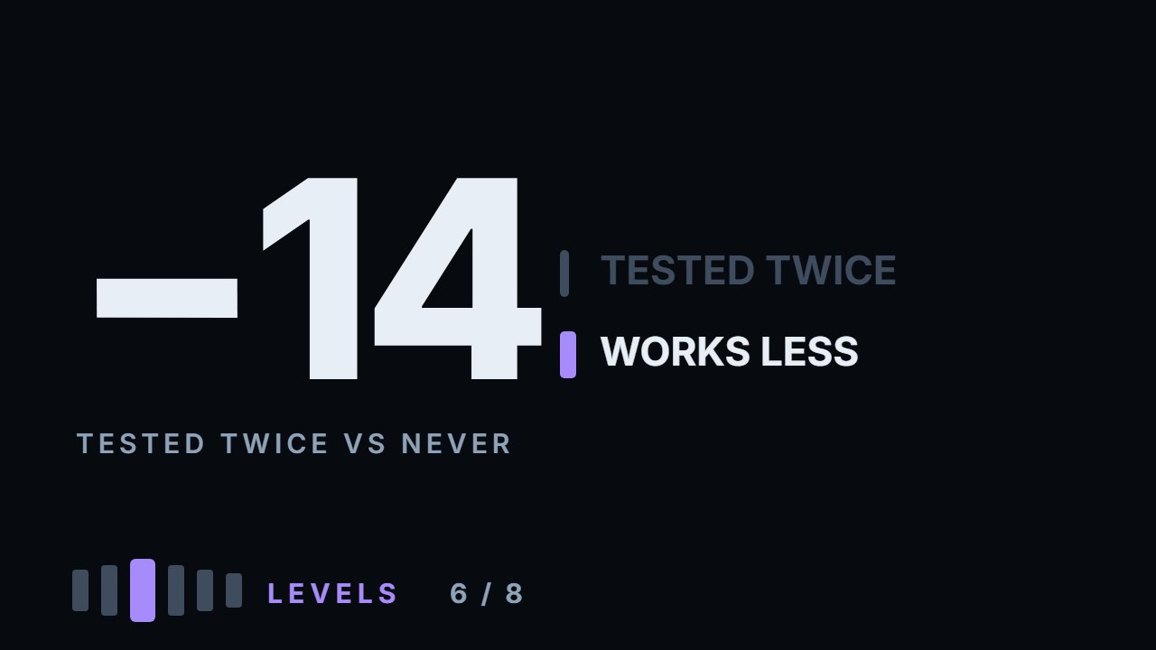
Touches are counted from two bars after a turn, when the turn starts to exist, and every separate touch is recorded. "A level tested many times is stronger" gets no support: on Apple a first touch and a third or later touch both bounce 75% of the time; five of six instruments come out negative and one flat, and together it is −4.5 points — just inside what this many touches can tell apart. What can clearly be told apart runs the other way: a level touched once before bounced less often than on its first touch on five instruments of six, about 6.5 points on the median, and any earlier touch costs about 6 points. "The level everybody can see works better": +1.5 together, from +6.3 on Tesla to −6.6 on Ethereum. Round numbers: from −17.9 to +13.1, nothing either way. Age: +4.3 together, nothing measurable. A turn made on a wide bar: +4.3 together — right at the edge, the best story of the five, and a hint rather than a rule. Combining the two most-taught criteria — visible and tested twice — produced levels that held less often on five instruments of six, −6.3 points on the median, but the selection leaves so few levels (1 to 23 touches an instrument) that together it is well within what the data can tell apart. Everything here is measured: the calculation ships with the video.
What to do with this
Take your last twenty trades at levels. For each, write down two things: how many times that level had been touched before you traded it, and whether the bar that created it was unusually large. Then split your results by those two columns. If the touched levels did worse, that is the one difference this video could measure, now in your own trades; twenty trades will not prove it either way, but it tells you where to look.
Chapters
- 0:00Fifty candidates, and the need to choose
- 0:53How every touch is counted
- 1:38The mistake the first version made
- 2:12"Tested many times is stronger"
- 2:33The other five, and no support for the rule
- 3:16The one difference that can be told apart
- 3:50"The level everybody sees"
- 4:56Round numbers and age
- 5:54The criterion with the best story
- 6:50Both popular criteria together
- 7:57Three honest limits
- 8:51The ranking the numbers write
- 10:12Go and do this
The calculation
Every number this lesson says out loud comes from the script below. results.txt is what it printed when the video was made.
Full transcript
A chart gives you fifty candidate levels for every hundred days, and you can trade two of them.
The turns video ended with that problem: a basis that barely beats the same line moved half a range away — not enough to trade any of them. So you need to choose. Everybody has criteria for choosing, and this video measures five of the most common ones.
Four of the five cannot be told apart from chance on six instruments, and the fifth only just reaches the edge. The one difference that clearly can be told apart is not on anybody's list, and it points the other way from the most popular rule. By the end you'll be able to rank the levels on your chart by what was measured, not by what is usually taught.
The measurement first, because the setup decides what the numbers mean.
Every turn on the chart becomes a level — counted, as in the turns video, from two bars after it, when the turn starts to exist. Then every separate touch of that level is recorded, not just the first one.
Separate means price left and came back — moved half a daily range away in between. A week of hugging the line is one touch, not five.
And a level lives until it is broken. Once price closes a full daily range beyond it, that level is finished and its touches stop being counted.
The first version of this calculation got that wrong, and it is worth a sentence because the mistake is easy to make.
It measured only the first touch. But the criterion how many times has this level been tested does not exist on a first touch — it is zero by definition. Every group came out empty.
With all touches recorded, the base rate across six instruments is between seventy four and eighty two per cent of touches producing a bounce. That is the number every criterion has to beat.
Criterion one, and it is the most repeated of all. A level that has been tested many times is stronger.
On Apple: a level touched for the first time bounces seventy five per cent of the time. On its third touch or later, seventy five as well.
That is no difference at all.
Tesla, minus five. The index fund, minus three point six. Bitcoin, minus twelve. Ethereum, minus three point eight. Solana, minus three point five.
Five of six negative and one flat, a median of minus three point seven. Taken together, about minus four and a half — just inside what this many touches can tell apart. Not the opposite of the rule, then. Just no support for it.
The mechanism people give is not mysterious. A level holds because orders are sitting there. Every touch consumes some of them.
And here is where it does show. A level touched once before bounced less often than on its first touch — on five instruments of six, by about six and a half points on the median, and that is beyond what this many touches can tell apart.
So the honest version runs against the rule, and it is smaller than the rule sounds: a fresh level is worth a little more than a tested one — about six points, counting every touch after the first.
Criterion two, almost as popular. The level everybody can see is the one that works, because everybody acts on it.
Measured as the extreme of the last sixty days — the level you would notice at a glance on a chart, without scrolling.
On Apple, visible levels bounced seventy eight point four per cent against seventy two point seven for the ones nobody would notice. Almost six points better.
Tesla, six better. The index fund, almost three worse. On the three coins it ran from minus six and a half to plus two.
So being obvious is not an advantage — and not a handicap either. Three of the six came out worse, the median is about zero, and together it is well within what this many touches can tell apart.
Whether being seen changes anything else — how often a level breaks, and how far price runs after — is the next video.
Criterion three. Round numbers — a price with one non-zero digit, like two hundred or sixty thousand, give or take two per cent.
Across six instruments it runs from minus eighteen to plus thirteen — and together, too close to tell apart on this many touches. Nothing, in either direction.
Round numbers matter for where orders cluster, which is a real effect on the order book. It does not show up in whether a daily level holds.
Criterion four. Age — is an old level better than a fresh one?
Median plus four, from minus fourteen on Ethereum to plus fourteen on Apple — and together, within what this many touches can tell apart.
Nothing measurable there either — and since old levels are mostly tested ones, the two are hard to pull apart in this data.
Criterion five, and it has the best story of the five.
A turn made on a wide bar — a day that travelled more than one point eight times the usual — against a turn made on an ordinary bar.
Apple: plus three point three. Tesla: plus one point six. The index fund: minus two point seven. Solana: minus zero point eight.
Bitcoin and Ethereum: plus ten and plus eleven. The median of the six is plus two point four — and together about four, right at the edge of what this many touches can tell apart.
The usual story is that a wide bar is a day when a great deal changed hands in a hurry, and whatever was left unfinished is left near its edges. This measurement finds a hint of it, and no more.
Now put the two most popular criteria together, because that is what people actually do.
Take only levels that are visible — a sixty day extreme — and that have been tested at least twice. The classic strong level.
On Apple that selection bounces seventy five per cent, against seventy four point one for levels nobody would notice that were never tested.
Tesla: sixty nine point two against seventy seven point nine. The index fund: seventy three point nine against seventy seven point five.
Worse on five of six. Median difference: minus six points.
Read that carefully. Selecting by the two most taught criteria produced levels that held less often on five instruments of six — but the selection leaves so few levels that, taken together, it is well within what the data can tell apart.
Not proof that it hurts. No sign at all that it helps.
Three honest limits, and the first is the biggest.
One: this is a bounce measured at five days on daily bars. It says nothing about what a level does intraday, where most people actually trade them.
Two: sample sizes shrink fast when criteria are combined. The strict selection on Bitcoin is one touch, and one touch is a story, not a statistic. The six instruments taken together are the number to trust, not any single cell.
Three: a level being consumed by tests is measured here as a property of the level. Somebody could reasonably argue it is a property of the market regime — whether the whole market was trending or going sideways — and this calculation cannot separate those.
So what does the ranking look like when the numbers write it? Tested before, minus six. Tested twice or more, minus four and a half. Visible, plus one and a half. Old, plus four. Round, plus two point six. A wide bar, plus four. Only the first of those is clearly beyond what this many touches can tell apart; the wide bar just reaches the edge.
First: prefer untested levels. A level price has not returned to since it formed is the best version of it you will ever get.
Second: a turn made on a wide bar came out about four points better — right at the edge. Worth noticing; not yet worth a rule.
Third: ignore round numbers and age — neither measured anything.
Fourth: visibility measured nothing here either. What it might change instead is the next video.
And notice what this does to how you look at a chart. The levels that draw your eye — old, obvious, touched five times — measured no better than the ones nobody notices, and the touched ones measured worse.
So, what to go and do. Twenty minutes, and it will change what you mark.
Take your last twenty trades at levels. For each one, write down two things: how many times that level had been touched before you traded it, and whether the bar that made it was unusually large. No trades yet? Take twenty touches of levels from a chart six months back and write down the same two things.
Then split your results by those two columns. If the touched levels did worse, that is the one difference this video could measure, now in your own trades. Twenty trades will not prove it either way, but it tells you where to look.
Fresh beats proven, and the chart is not sorted in your favour. Educational content only. Nothing here is financial advice.
Educational content only. Nothing in this video is financial advice, a recommendation to buy or sell, or a promise of any result. Trading involves risk of loss. Do your own research. Risk warning.