Measuring a Channel
 Video coming soon on YouTube
Draw a channel on any chart and it will look right. That is the problem: two points make a line, and a chart of two thousand days offers thousands of pairs. So this video calculates the channel instead — a least-squares fit plus two standard deviations — and then measures the three things people expect from it.
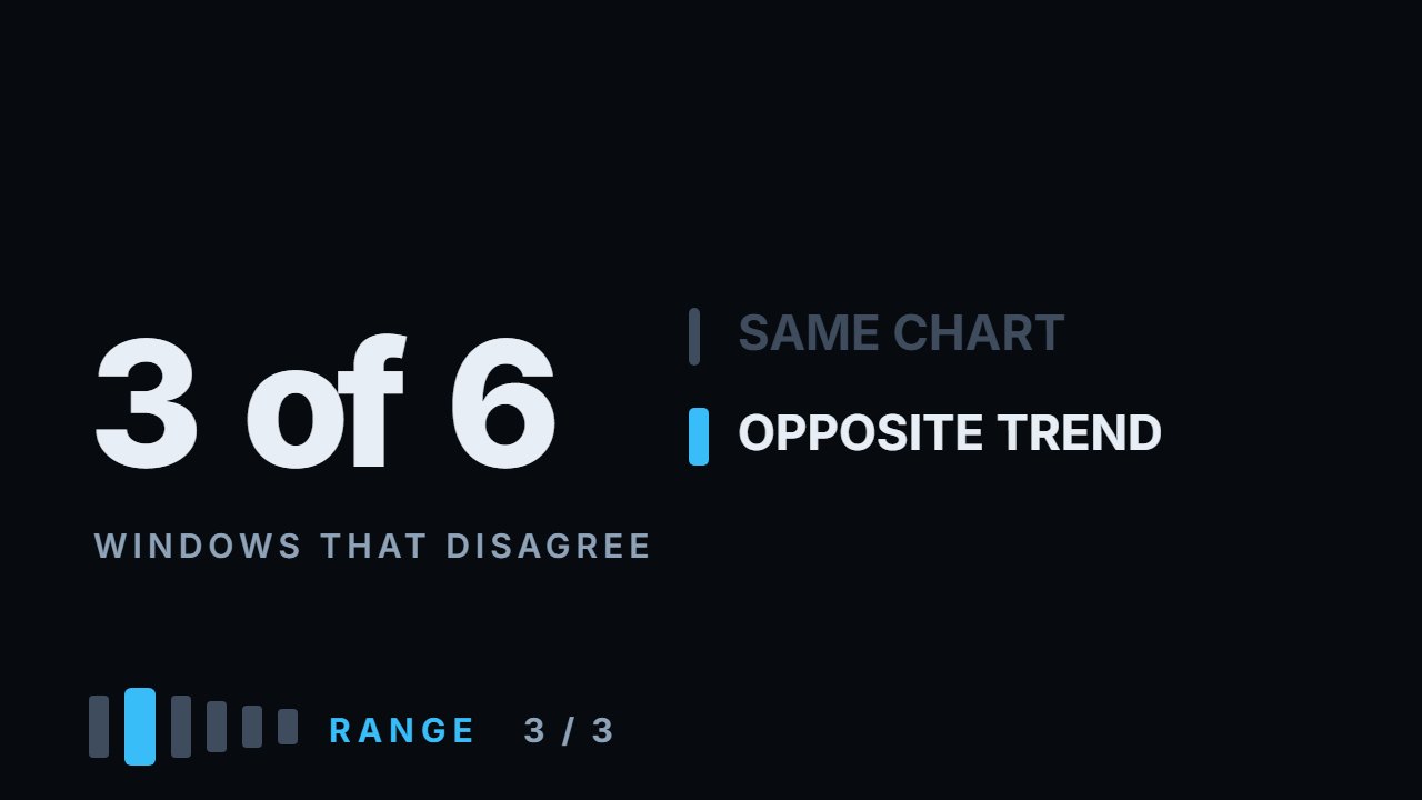
Price sits inside the band between 76% and 86% of the time, on every window from 20 days to 120: something that contains four days out of five describes where price has been, it cannot be a signal. A touch of the edge is followed by a move toward the middle 42.7% to 53.4% of the time, against base rates of 46% to 49% — a spread of −3.4 to +4.1 points, which is noise. And the channel is mostly your settings: one new bar moves a 20-day slope by up to 2.14 percentage points, and on three of the six instruments the 20, 60 and 120-day windows disagree about the direction outright. On Tesla, the same day, the same chart: +9.8% over 20 days, −7.2% over 60. A channel is not a forecast — it is a unit of measurement, and that is what it is good for. Everything here is measured: the calculation ships with the video.
What to do with this
Pull sixty closes for anything you trade and run a linear fit — every spreadsheet has one built in. Take the standard deviation of the differences between the closes and the fitted line: that is your band. Then do it again with 20 and with 120 and put the three slopes side by side. If they disagree, you have learned the most useful thing in this video before anyone tells it to you.
Chapters
- 0:00Any channel you draw will look right
- 0:43What a calculated channel is
- 1:31How much of the time price is inside
- 2:30Does a touch bring price back?
- 2:40The measurement that was wrong, and why
- 3:23The numbers, against their base rates
- 4:29How stable is the line you drew
- 5:34The trade-off between short and long windows
- 5:50Three windows, one day, opposite answers
- 6:54The widths disagree too
- 7:18What a channel is actually good for
- 7:36Two standard deviations, any instrument
- 9:11Three honest limits
- 10:15Go and do this
The calculation
Every number this lesson says out loud comes from the script below. results.txt is what it printed when the video was made.
Full transcript
Draw a channel on any chart and it will look right. That is not a compliment to your eye. It is the problem.
Two points make a line, and a chart of two thousand days offers you thousands of pairs. Whatever slope you want, the points to support it are already there.
So this video does the opposite. The channel gets calculated, the same way by anyone who runs the numbers, and then three things people expect from it get measured.
By the end you will know how much of the time price sits inside a channel, what actually follows a touch of the edge, and how much of the channel is the market versus how much is your choice of settings.
Start with what a calculated channel is, because it removes the argument about where to draw it.
Take the last sixty closes. Fit the single straight line that sits closest to all of them at once — the one that minimises the squared distances. That is the middle of the channel, and everybody who does this gets the same line.
Then measure how far the closing prices scatter around that line. The standard deviation is the typical size of those distances. Put the edges two of them out on each side, and about nineteen closes in twenty of the window sit inside. No opinions, no touches to choose, no drawing.
Now the first question, and it is the one that decides whether a channel says anything at all. How much of the time is price inside the band?
Build the band on the days before, then check the next day's close. Across six instruments and every window from twenty days to a hundred and twenty: between seventy six and eighty six per cent. Inside its own window, the same band holds ninety six.
Read the four in five as a statement about information. Something that contains four days out of five is a description of an ordinary day. It cannot be a signal, because a signal has to exclude things.
Which is worth saying plainly, because the phrase price is at the top of the channel sounds like an event, and most of the time it is simply the fifth day.
Second question, and this is the reading everybody uses. Price touches the upper edge — does it come back toward the middle?
The measurement has to be careful here, and the first version of it was wrong, so it is worth explaining what went wrong.
The obvious test asks whether price returns all the way to the middle line. But from the edge that is a journey of two standard deviations, and from an average day it is half a step. Two different distances, one comparison, and the answer comes out meaningless.
So the question was made identical for both. After a touch of either edge: has price moved toward the middle five days later? And the base rate: from any day on that side of the middle, the same question.
Same question, same horizon, both sides measured the same way. Now the numbers mean something.
Apple: forty two point seven per cent after a touch, against a base of forty six point one. Slightly worse than average.
Tesla: forty five point eight against forty seven. The index fund: fifty three point four against forty nine point three.
Bitcoin: fifty point five against forty six point eight. Ethereum: forty eight point five against forty eight point nine. Solana: forty seven point one against forty seven point eight.
Six instruments, over a thousand touches, and the spread against the base runs from minus three point four to plus four point one.
That is noise. Touching the edge of a channel tells you nothing about the next five days that you did not already know from the day being ordinary.
Third question, and this is the one nobody asks. How stable is the line you just drew?
A channel gets redrawn every day, because tomorrow adds a bar. So measure what one new bar does to the slope.
On a twenty day window, Solana's slope moves two point one four percentage points per bar. Ethereum, one point eight six. Tesla, one point nine three.
Those are percentage points of slope measured over twenty days — so on a channel sloping up nineteen per cent, one ordinary bar moves the slope by two.
Five bars, a single trading week, and the slope has moved by ten. Nothing happened. The channel just aged.
Lengthen the window and it steadies. At sixty days the same instrument moves zero point five six per bar, at a hundred and twenty, zero point two one.
Which is the first real trade-off in this video. A short window follows price closely and changes its mind constantly. A long window is stable and describes a market that may no longer exist.
And now the fourth thing, which is the reason this video is in the range module and not in the levels module.
Take one day — the last day of the data — and draw all three channels on it. Twenty days, sixty days, a hundred and twenty.
On Tesla the twenty day channel slopes up nine point eight per cent. The sixty day channel slopes down seven point two. The hundred and twenty day channel slopes down two point two.
Same chart. Same day. Same instrument. Up and down at the same time, and every one of those three lines is correctly calculated.
On three of the six instruments the three windows disagree about the direction outright.
So when somebody says the trend is up, the sentence is incomplete until they say over what window. Without that, it is not a claim about the market. It is a claim about a setting.
The widths disagree too, and by more than people expect.
On Bitcoin the twenty day band is seven point one per cent wide on each side. The hundred and twenty day band is seventeen point four.
Same instrument, same day, and far from the edge on one chart is right at the edge on another.
At this point the honest question is whether a channel is worth drawing at all. It is — but not for the reason it is usually drawn.
A channel is not a prediction. It is a unit of measurement, and that is a genuinely useful thing to have.
Here is the useful form. Instead of asking is price high, ask how many standard deviations from the middle is price, on a window I chose in advance.
That number is comparable across instruments, across time, and across people. Two standard deviations on Apple means the same thing as two on Solana, even though one is a two per cent move and the other is nine.
It is the same trick as the range module. Distance in per cent is not comparable between instruments; distance in daily ranges is. Distance in dollars from a line is not comparable either; distance in standard deviations is.
Which gives the two things a channel is actually good for.
One: sizing an expectation. If the band is eight per cent wide and your target is twelve, you are asking for more than the usual scatter around the line — possible along the slope, unusual against it. That is not forbidden, but you should know you are asking for it.
Two: comparing today with the recent past on a fixed setting. Chosen in advance and never changed to fit the chart, a channel tells you whether today is ordinary or unusual, in a number.
Both are measurements. Neither is a forecast, and the measurements above are the reason.
Three honest limits, and the first one matters most.
This is a straight line fitted to closes. Markets are not obliged to be straight, and when they curve the fit is poor and the band is wide — the method tells you that by widening, but it does not refuse.
Two: two standard deviations is a choice, and every number in this video moves if you choose differently. Wider bands mean fewer touches and less noise; narrower means the opposite.
Three: five days after a touch is also a choice. A different horizon gives different numbers, and none of the horizons I tried moved the answer out of the noise.
So the working rule is short. Pick a window and a width before you look, write them down, and never change them because a chart looks better the other way.
Then use the channel to say how far, not which way.
What to go and do, and this one takes ten minutes in a spreadsheet.
Pull sixty closes for anything you trade. Run a linear fit — every spreadsheet has one built in. Take the standard deviation of the differences between the closes and the fitted line.
Then do it again with twenty and with a hundred and twenty, and put the three slopes side by side. If they disagree, you have learned the most useful thing in this video before anyone tells it to you.
A channel measures. It does not decide. Educational content only. Nothing here is financial advice.
Educational content only. Nothing in this video is financial advice, a recommendation to buy or sell, or a promise of any result. Trading involves risk of loss. Do your own research. Risk warning.