Levels From Turns and Wide-Range Bars
 Video coming soon on YouTube
There are two places almost everybody draws a level: the extreme of a turn, and the edge of an unusually big bar. Both were measured here, and the answer is more interesting than yes or no.
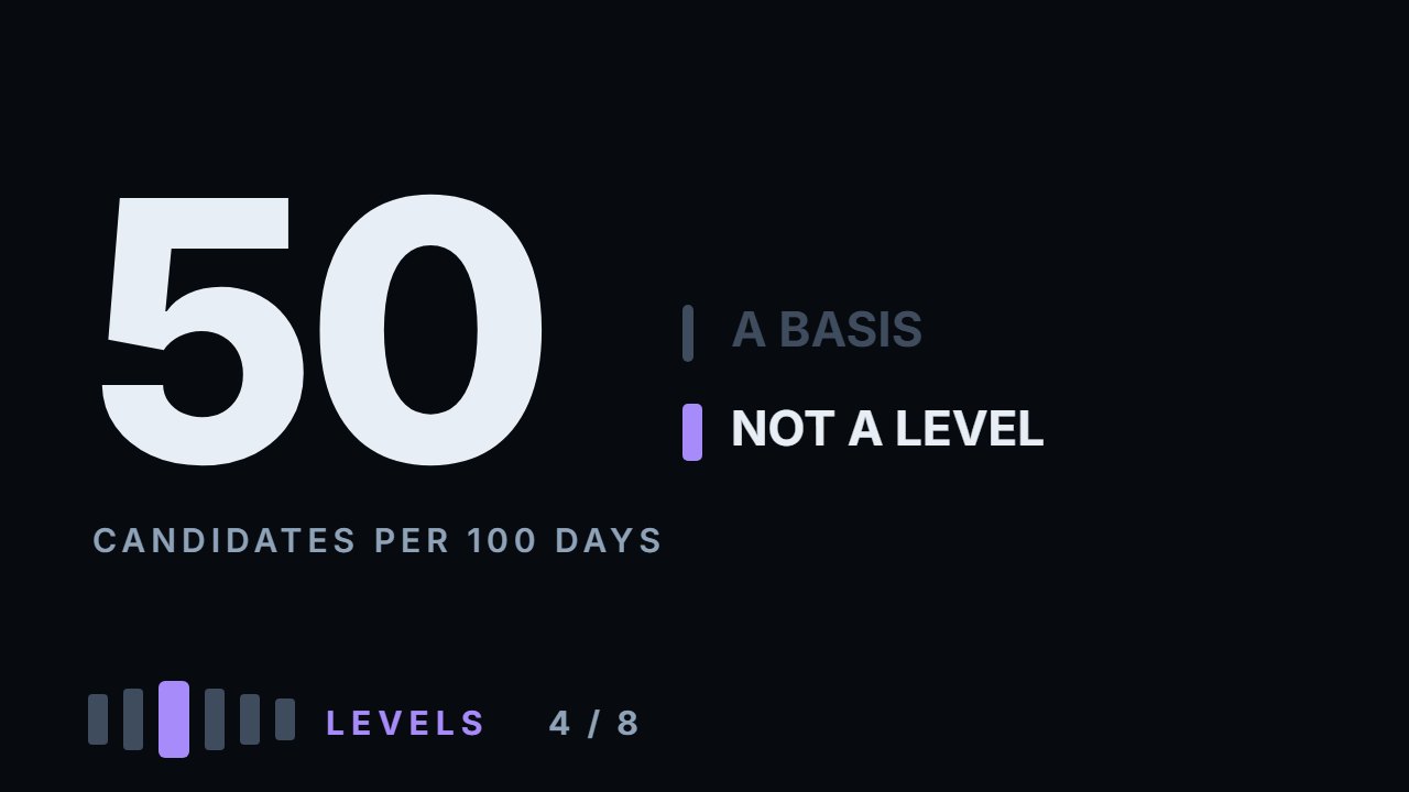
First, the problem that makes measurement necessary: turns and wide-bar edges come to about 50 candidate levels per 100 trading days, on every one of six instruments. Roughly one new base every two days — so there is always a level nearby, and the question is only whether that particular line does anything. Against a random horizontal line, turns look good: about 4 points more bounces. But a turn is an extreme and price arrives at it from one side only, so that comparison measures edge against middle. The honest control keeps the edge and removes only the precision: the same turn, moved half to one and a half daily ranges away. One more rule changes every number: a turn exists only once the next two bars have failed to beat it, so touches are counted after those two bars. Counted from the very next bar, two in five first touches land on them and bounce 97% of the time — the definition of a turn makes them bounce. Counted honestly, turns beat their shifted twins by −1.0 to +7.8 points, median +0.8, and on no instrument is the gap beyond what its touches can tell apart — Bitcoin, at +7.8, sits right at the edge. A mark half a daily range off bounced just as often as the turn itself; it took a range and a half to lose a measurable amount, about three points. Wide-bar edges: median +1.0. The low edge bounced more often than the high on all six — but so did a shifted copy of it. And 72–78% of turns get revisited within 120 days, which is why levels feel so much better than they measure. Everything here is measured: the calculation ships with the video.
What to do with this
Open a chart you have never traded and mark every turn on the last hundred bars — every bar whose high beats its two neighbours on each side, and every bar whose low sits under them. Count them: if you expected ten or fifteen, the count comes out closer to thirty. Then pick five at random and check what price did when it came back. You will find bounces almost everywhere, which is exactly the point.
Chapters
- 0:00The two places everybody draws a level
- 0:26Counting the bases: 50 per 100 days
- 1:19What to measure a level against
- 1:52Why the obvious control is misleading
- 2:18The honest control: the same turn, moved
- 2:41The definitions that decide everything
- 3:07Why the count starts two bars after a turn
- 3:42The turn against its shifted twin
- 4:24The one instrument where it shows
- 5:23Wide bars, measured the same way
- 6:03Which edge of a wide bar
- 7:06Why levels feel better than they measure
- 8:00Three honest limits
- 9:10What this leaves you with, practically
- 10:37Go and do this
The calculation
Every number this lesson says out loud comes from the script below. results.txt is what it printed when the video was made.
Full transcript
There are two places almost everybody draws a level. The high or low of a turn, and the edge of an unusually big bar. This video measures both, and the answer is more interesting than either yes or no. By the end you'll be able to count candidate levels on any chart and see why a basis is not yet a level.
Start with the problem that makes the measurement necessary. Count the turns.
A turn is a bar whose high is above the two bars on each side of it, or whose low is below them. On Apple's eight years that gives five hundred and twenty eight of them.
Wide bars — days that travelled more than one point eight times the usual — give another two hundred and nineteen, and each has two edges.
Put them together and it comes to about fifty candidate levels for every hundred trading days, on every one of the six instruments.
Roughly one new candidate every two days. Which means the question is never whether there is a level nearby. There always is. The question is whether that particular line does anything.
So it has to be measured against something, and choosing that something is the whole job.
The obvious control is a random horizontal line in the same place on the chart. Draw it, wait for price to come back, see what happens.
Against that control, turns look good: a bounce rate about four percentage points higher, on the median — a bounce meaning price came close, then moved away. That number is real, and it is also misleading.
Here is why. A turn is an extreme. Price comes back to it from one side only, and to count as a bounce it just has to fail to go through.
A random line sits inside the range, price arrives from either side and walks through it without anything special happening. So that comparison is measuring edge against middle, not level against no level.
The honest control keeps the edge and removes only the precision. Take the same turn, on the same day, and move the line half a daily range to one and a half daily ranges away.
Now both marks are at extremes, both wait for price to return, and the only difference is whether the line is exactly where the turn was.
Before the numbers, the definitions, because they decide everything that follows.
A touch is price coming within a quarter of a daily range of the line. A bounce is price then moving half a daily range back the way it came, within five days.
Not a prediction, not a signal — a measurable event. Came close, moved away.
One more rule, and it changes every number that follows. A turn exists only once the next two bars have failed to beat it. Count touches from the very next bar, and two in five first touches land on those two bars — and they bounce ninety seven per cent of the time, against seventy six for the rest. The definition of a turn made them bounce. So every count here starts after those two bars.
Counted that way, turns on Apple bounce seventy three point nine per cent of the time. The same turns, shifted, bounce seventy four point five. Half a point the other way.
On Ethereum: seventy three point two against seventy one point six. One and a half points — within what this many touches can tell apart.
On Solana: seventy eight point one against seventy three point seven. Four and a half points, and the same verdict.
So far, the exact line is not doing much. A line moved half a range to a range and a half away does about as well.
On Bitcoin: eighty three against seventy five point two. Almost eight points — the largest of the six, and right at the edge of what its touches can tell apart. The other two coins sit at about two and four.
Tesla: seventy four point nine against seventy four point nine. Nothing at all.
The index fund: seventy three point seven against seventy four point seven. The shifted line came out slightly ahead — as it did on Apple.
Across the six, the difference runs from minus one to plus seven point eight, with a median of plus zero point eight.
Put together, it is within what this many touches can tell apart, and no single instrument clears that bar on its own. A turn does not measurably beat its own shifted twin.
Now the wide bars, measured exactly the same way.
Bounce rates look similar — seventy to eighty nine per cent — but against their own shifted control the difference vanishes on four of the six. Only Ethereum and Solana keep it, at plus six point four and plus six point nine. Median plus one.
So neither basis does much better than its own shifted twin: a turn by about one point on the median, a wide-bar edge by about one. Both are candidates, and neither is a level yet.
There is a second question about wide bars that people argue over, and it settles quickly.
A wide bar has two edges, its high and its low. Is one of them better?
On all six the low edge bounced more often than the high — Apple, Tesla, the index fund, Bitcoin, Ethereum, Solana. On the index fund it was seventy point five against eighty five point four — almost fifteen points apart.
But marks that mean nothing lean the same way: shift every edge by a daily range, and the shifted lows still bounce more often than the shifted highs, on all six — these prices mostly rose over the sample. Measured against its own shifted twin, the low edge does better than the high edge on four instruments, and no better on the other two. Take both edges, and treat them the same.
One more number, and it explains why levels feel so much better than they measure.
Between seventy two and seventy eight per cent of turns get revisited within a hundred and twenty days.
So three lines in four that you draw do get tested. Every level gets its moment, and your memory keeps the ones that worked.
With three touches in four producing a bounce, and three turns in four getting revisited, a chart full of levels produces an endless supply of examples in both directions.
That is the mechanism behind the feeling that levels obviously work. They obviously do something. The measurement is about how much of it is the line and how much is just price coming back. Here, most of it turns out to be the edge, not the line itself.
Three honest limits, and they are all about the definitions.
One: the bounce threshold. Half a daily range within five days is a choice. Ask for a full daily range and every number drops; ask for a quarter and every number rises. What changes less is the direction: on the median the turn stays slightly ahead at every threshold — by about two and a half points at a quarter, one at a half and one and a half at a full range.
Two: the shift distance. Moving the line by a quarter or half a daily range made no difference at all. A full range cost about two points, and a range and a half about three — the only shift this data can tell apart from chance.
Three: this is daily bars. A level drawn on a five minute chart is a different object measured at a different scale, and none of these numbers transfer to it.
So what does all this leave you with, practically?
First: a basis makes a candidate, not a level. Fifty candidates per hundred days is not a plan.
Second: neither basis has earned a preference. Against its own shifted twin, a turn gained zero point eight points on the median and a wide-bar edge one, and neither is beyond what this many touches can tell apart. Mark both.
Third: the exact price matters less than the drawing implies. A mark half a daily range off bounced just as often as the turn itself; it took a range and a half to lose a measurable amount — about three points. So mark the area around the extreme, and stop arguing about cents.
Fourth, and this is the practical one: since the basis alone does not qualify a level, something else has to. That is ranking, and the ranking video measures it.
What ranks a level is not the basis alone. It is how many times it has been tested, how old it is, what kind of bar made it, and whether anybody else can see it.
All of which are measurable, and all of which the ranking video measures.
So, what to go and do. It takes fifteen minutes and it is the cheapest way to feel this yourself.
Open a chart you have never traded. Mark every turn on the last hundred bars — every bar whose high beats its two neighbours on each side, and every bar whose low sits under them.
Count them. If you expected ten or fifteen, the count comes out closer to thirty.
Then pick five at random and check what price did when it came back. You will find bounces almost everywhere, which is exactly the point.
The lines that matter are not the ones price touched. They are the ones that survive the next question.
Because a level you can draw is not the same as a level worth trading, and the difference is measurable.
A basis gives you a candidate, not a level. Which candidate earns a trade is what the ranking video measures. Educational content only. Nothing here is financial advice.
Educational content only. Nothing in this video is financial advice, a recommendation to buy or sell, or a promise of any result. Trading involves risk of loss. Do your own research. Risk warning.