Levels From Consolidation
 Video coming soon on YouTube
Twenty candles that go nowhere. Everyone has a name for it — chop, a saw, a range — and everyone has advice, usually that a big move is coming. This is what the shape actually is, why it leaves the densest level on the chart, and how to measure it instead of squinting at it.
Then the part I did not expect: I counted the claim that a strong move follows a consolidation, across 1,074 windows and six instruments. It is not there.
About the numbers
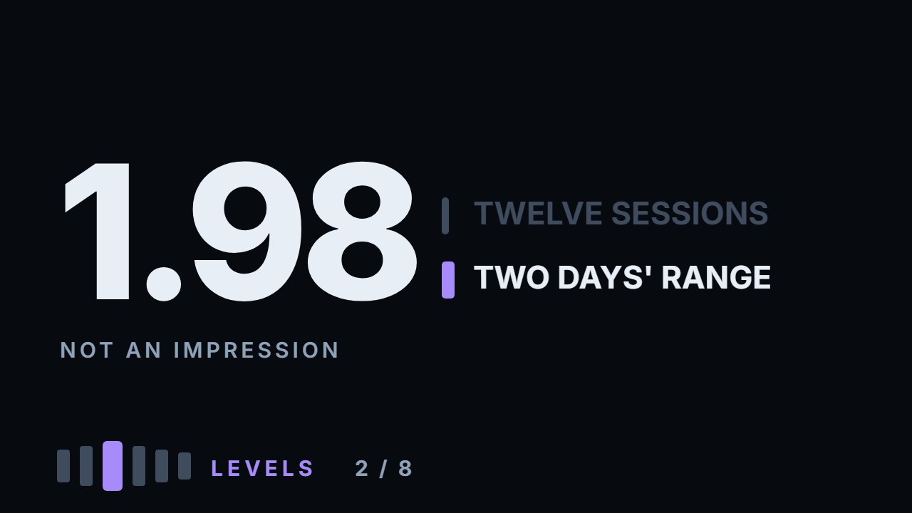
Everything here is measured, not asserted. The worked example is the S&P 500 fund, 28 November to 15 December 2025: a band of $10.51 against an average daily range of $5.32, which is 1.98. The distribution comes from 1,134 twelve-session windows across six instruments with two hundred sessions on each — median 3.54, tightest quarter under 2.96, widest 10.12. The forward test uses the 1,074 of those windows that have ten more sessions after them: range covered 3.14 daily ranges after the tightest quarter against 3.11 after the rest, and directional move 1.05 against 1.42. Overlapping windows, one period, six instruments — that does not settle the question everywhere, and it is enough to stop trading on the claim.
What to do with this
Take one instrument. Measure the last twelve sessions: the whole band, highest high to lowest low, divided by the average daily range over those same days. Write the number down. Most of the time it lands near 3.5, and once you have seen that a few times you stop calling ordinary weeks quiet. Then look back six months, find the tightest twelve sessions in that window, and mark that band with two lines rather than one. That band is a level you can use, and it costs nothing to keep on the chart.
Chapters
- 0:00The shape everyone argues about
- 0:32Four things
- 0:56It is not a line
- 1:21The same three mechanisms
- 1:53The measurement
- 2:16Worked: 28 Nov — 15 Dec 2025
- 2:48What that requires
- 3:24The band, both edges
- 3:56What ordinary looks like
- 4:26Not a matter of taste
- 4:55The same twelve sessions, in April
- 5:23The claim
- 6:02What the count says
- 6:34There is no move
- 7:04The story attached to it
- 7:35What survives
- 8:11How to use it
- 8:39A wick, or a close
- 9:01Two places it stops working
- 9:30Go and do this
The calculation
Every number this lesson says out loud comes from the script below. results.txt is what it printed when the video was made.
Full transcript
There is a shape on every chart that people argue about. Twenty candles that go nowhere. Price pushes up, comes back, pushes down, comes back, and after a month it is where it started. Everyone has a name for it. Chop. A saw. A range. And everyone has advice: stay out, it is noise. Or the opposite — get ready, because a big move always follows.
By the end of this you will have four things. What that shape actually is. Why it leaves the strongest level on the chart. How to measure it instead of squinting at it. And what happens when you count the claim everyone repeats about it. That last one did not come out the way the courses say it does, and the number is in this video.
Start with what it is not. It is not a line. You cannot honestly draw one horizontal through it, because price did not respect one price — it kept coming back to a band. That is the first thing to accept. A consolidation level is a band with a top and a bottom, and the width of that band is information you need later.
Why it makes a strong level is not new. It is the same three mechanisms from the video on what a level is, pressed into a smaller space. Position memory: everybody who bought or sold in that band is still carrying it. Resting orders: that is where the unfilled ones accumulated. Visibility: it is the most obvious shape on the whole chart, so everyone is looking at the same prices.
What is new is that you can measure it, and the measurement takes one line. Take twelve sessions. Measure the whole band — the highest high to the lowest low. Divide it by the average daily range over those same twelve days. That number tells you whether you are looking at a consolidation or at your own hope for one.
Work it on something real. The S and P five hundred fund, the twelve sessions from the twenty eighth of November to the fifteenth of December last year.
The band runs from six hundred and seventy nine to six hundred and eighty nine — ten dollars and fifty one cents from top to bottom. The average daily range over those days was five dollars and thirty two cents. Ten fifty one divided by five thirty two is one point nine eight.
Twelve sessions that covered two days' worth of movement. That is what a consolidation is, stated as a number rather than as an impression. Think about what that requires. The instrument still moved every day — five dollars and thirty two cents a day, on average, twelve days running. Almost all of it cancelled itself out. Sixty four dollars of daily movement produced ten dollars of net range, and the difference between those two numbers is business done in a very small space.
Here is the band on the chart, with both edges drawn. Notice what is not there. There is no single line to draw, and no candle that marks the level. What price respected was the region — it left the top, came back, left the bottom, came back, and did that for twelve sessions without closing outside either edge. Every one of those returns is a transaction someone is still carrying.
Now the part that makes the number useful — knowing what ordinary looks like. In this sample there are eleven hundred and thirty four twelve-session windows across six instruments. The median is three and a half. The tightest quarter all sit under three. And the widest window in the whole sample is ten point one — the same fund, in April, covering sixty seven dollars in the same twelve days.
So the boundary is not a matter of taste. Under three, you are in a consolidation. Around three and a half, you are in an ordinary stretch of market that merely looks calm. Above four, you are in a trend and the shape is not what you thought. Recompute those boundaries for your own instrument, because they are the shape of this sample and nothing more.
Same fund, same twelve sessions of chart, four months later. This is what five times wider looks like. There is no band here to draw. Days still overlap, but after the fourth day price never comes back to where it started. Nothing about the first picture announced itself as quiet until you had this one to put beside it — which is the reason to carry the number instead of the impression.
Now the claim. After a consolidation, a strong move begins. You have heard it in every course, and it does feel true. It feels true for a reason that has nothing to do with markets. The consolidations that ended in a violent breakout are the ones with a screenshot attached. The ones that drifted sideways for another month and then drifted back are not memorable enough to survive as examples. So the claim gets repeated by people who are, honestly, only remembering. It is also the kind of claim you can count. So I counted it.
One thousand and seventy four windows, six instruments, daily bars. Divide them: the tightest quarter against everything else. Then measure the ten sessions that followed each one. Range covered: three point one four daily ranges after the tight windows. Three point one one after the ordinary ones. Directional move, from close to close: one point zero five against one point four two.
There is no move. Not a smaller one than expected — the same one, and by the directional measure slightly less. Say what this is and is not. One sample, two hundred sessions on each of six instruments, overlapping windows. It does not prove the claim wrong everywhere. It does show that the effect is not large enough to find where I looked, and that is enough to stop sizing a trade on it.
There is a story attached to the claim, and it is worth naming. The story is that a large participant is deliberately sawing the level to shake positions loose before the real move. You cannot see intent in a chart. You can see that a great deal of business happened inside a narrow band, and that is enough to explain everything the band does afterwards. The story adds a motive that changes nothing you would do.
What survives all of this is the level itself, and it survives untouched. The band is the densest piece of memory on the chart: the place where the most positions were opened in the least room. When price comes back to it in a month, it is arriving at prices that a large number of people have an opinion about, and that is the whole of why a level does anything at all. That is a reason to mark it. It was never a reason to predict what comes next, and the two got welded together somewhere along the way.
So, how to actually use it. Inside the band there is nothing to do. Every touch of an edge is an edge of a region, not a level, and your stop has nowhere to sit. You wait for one bar that opens and closes on the same side of the band without breaking back into it. That bar is the instrument choosing a side, and it is the first thing in this shape that is not ambiguous.
And a break means a close beyond the band, not a touch of it. A wick through the edge is the market checking; a close beyond it is the market leaving. That distinction is the whole of the false-breakout video, and it applies here with more force than usual, because a consolidation edge gets touched constantly.
Two places this stops working. If the band is wider than about four daily ranges, it is not a level at all — the stop you would need does not fit inside your risk, and that is a different problem with a different answer. And on a thin instrument a narrow band can mean nobody was trading rather than everybody was. An absence of business leaves no memory to trade against.
So, the thing to go and do. Take one instrument. Measure the last twelve sessions: the whole band, divided by the average daily range. Write the number down — most of the time it will be near three and a half, and you will stop calling ordinary weeks quiet.
Then look back six months and find the tightest twelve sessions there. Mark that band with two lines, not one, and leave it on the chart. That is a level you can use, and it costs nothing to keep. Educational content only. Nothing here is financial advice.
Educational content only. Nothing in this video is financial advice, a recommendation to buy or sell, or a promise of any result. Trading involves risk of loss. Do your own research. Risk warning.